Electroluminescent Art & Music
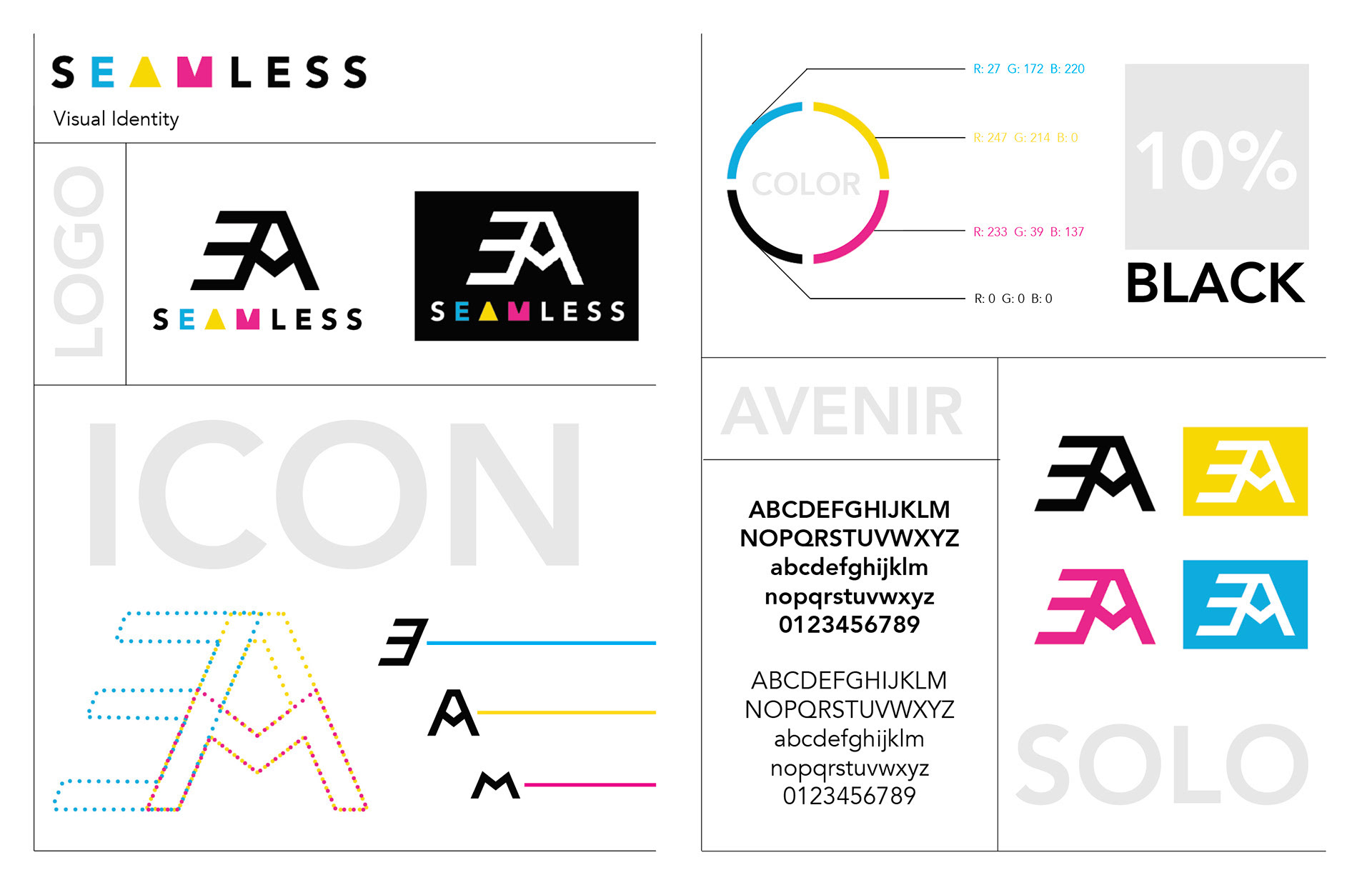
Seamless is a soon to be launched company that designs products that integrate art and music through the use of electroluminescent (EL) wire. I wanted to create an identity for the brand that had utilized the classic CMYK colors in order to portray the vast range of color their light installments have to offer. The icon is a hybrid of the three letters "E" "A" "M" which stand for electroluminescent art and music. The "EAM" within the text of the logo is simplified to more basic shapes to exhibit a sense of clean modernity which aligns itself with the products made by Seamless.
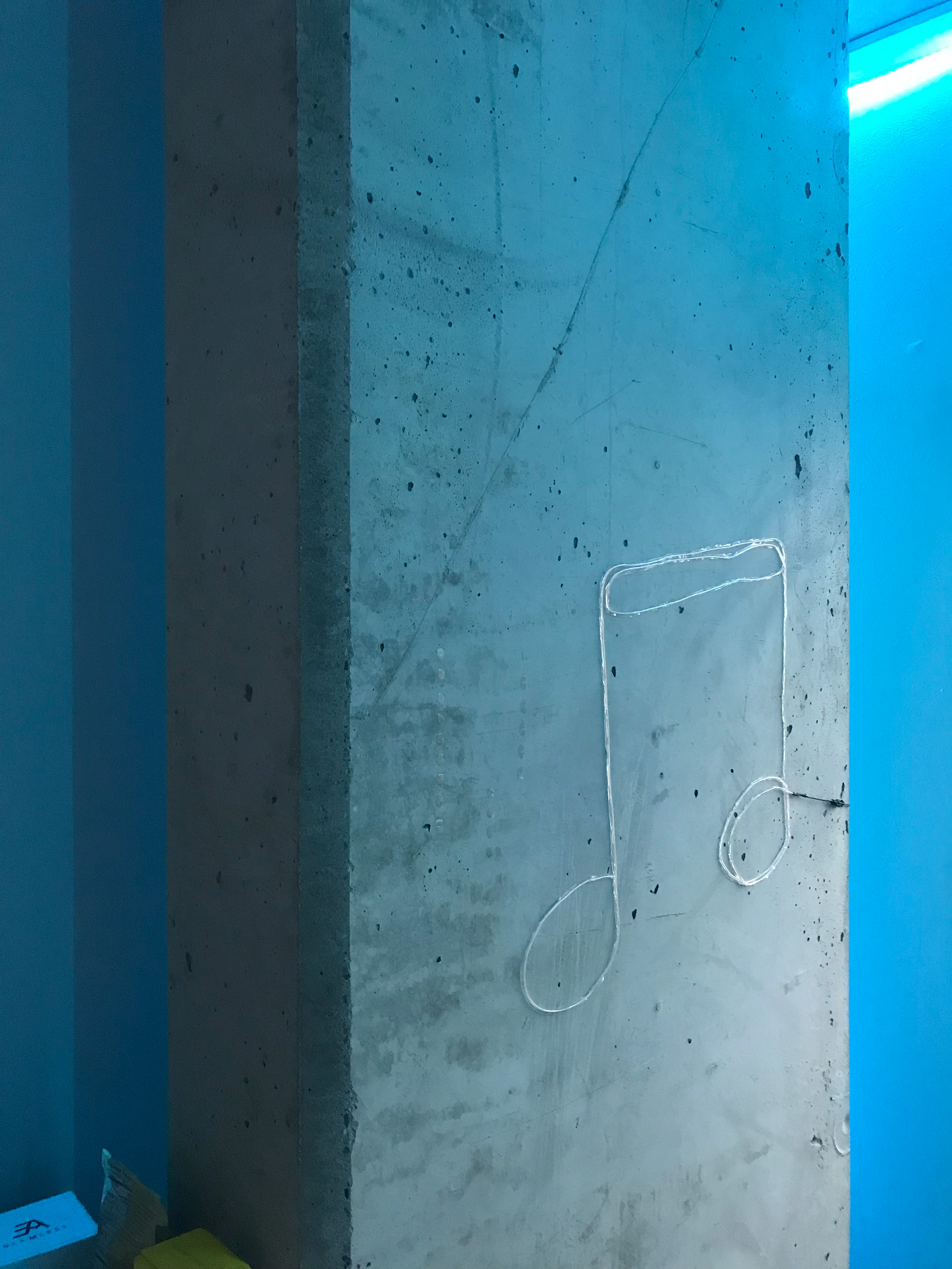

An image of one of the packaged products installed to give you an idea of the product of discussion.
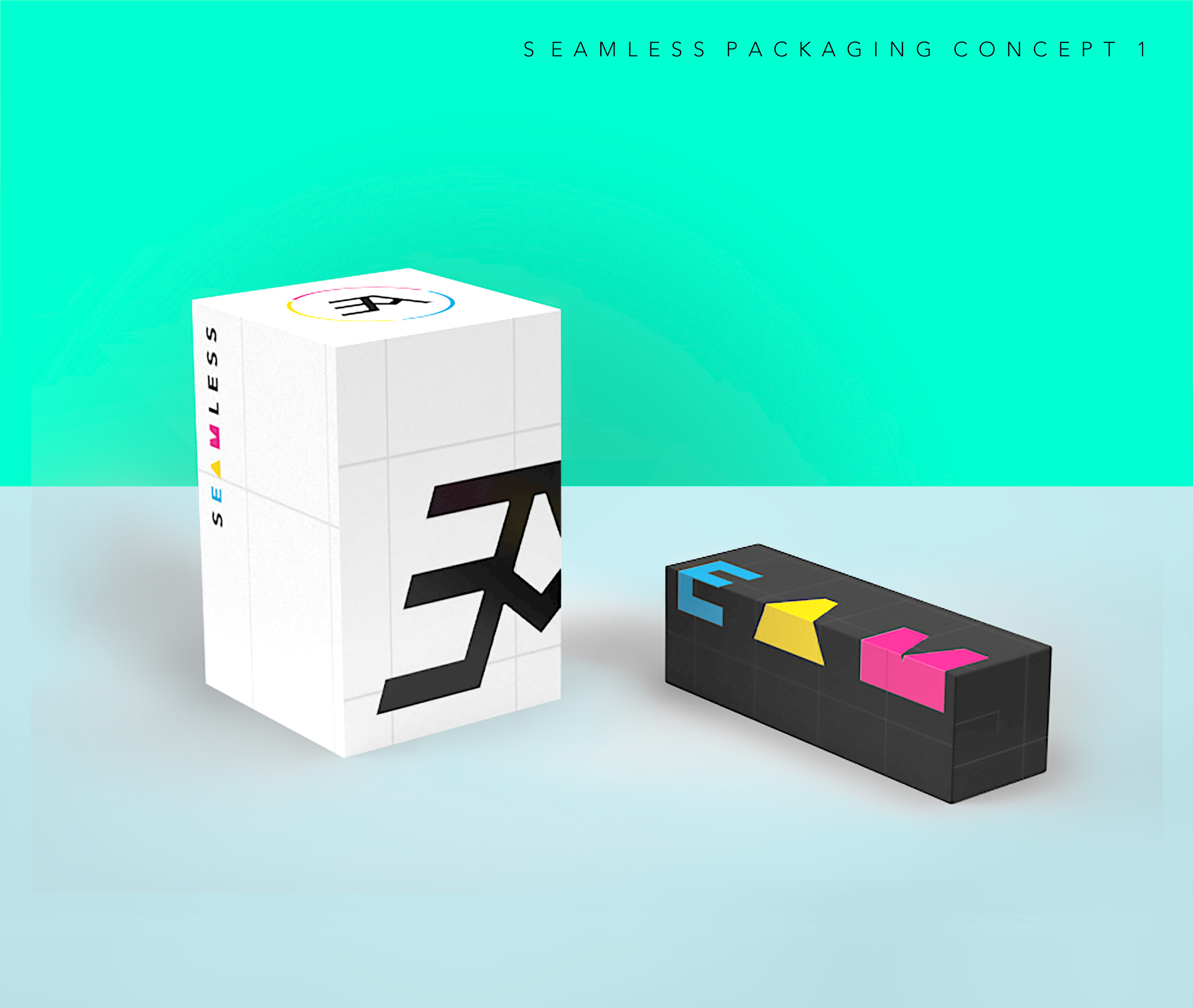
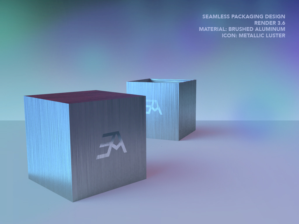
These are packaging concepts made to hold the B2C Seamless product. The company wanted the package and unboxing to be as much a part of the experience as the product itself. I wanted to give the company options in shape, color, and material.
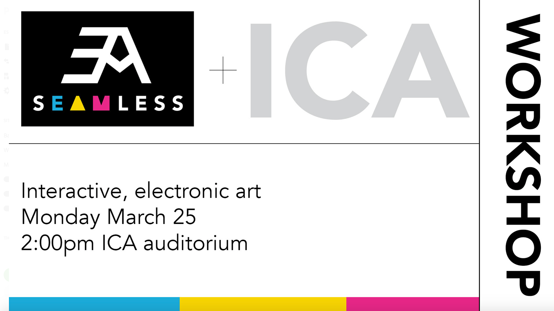
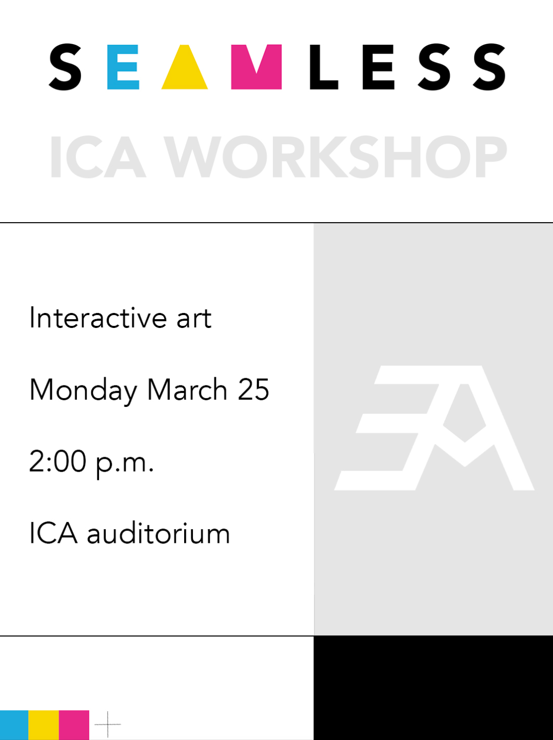
Above and below were graphics made for promoting a workshop hosted by the company in the Institute of Contemporary Art
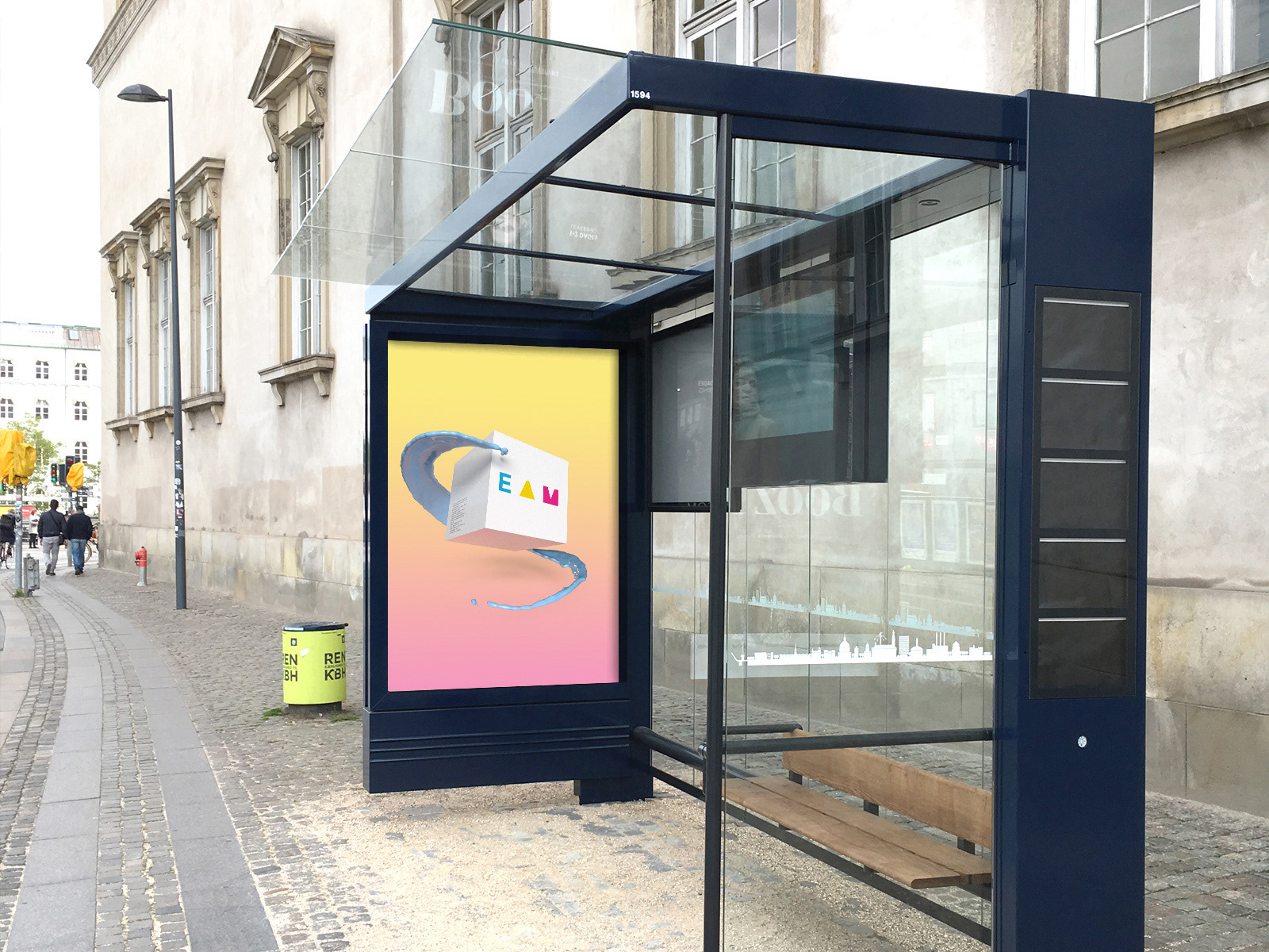
I wanted to create a buster add mockup just to bring a level of realism to the brand. I repurposed the packaging concept and overplayed that on a gradient background to create a design that aligns with the identity but also has imagery that is commonplace within the cleanliness of the tech world. I chose the box design rather than the actual product because I am unable to utilize images of the product as of yet since it is still patent pending. The company does not want to disclose other images to the public other than the previous one seen on this page.
This is an animation of the logo I made that they will be using in digital promotional content.