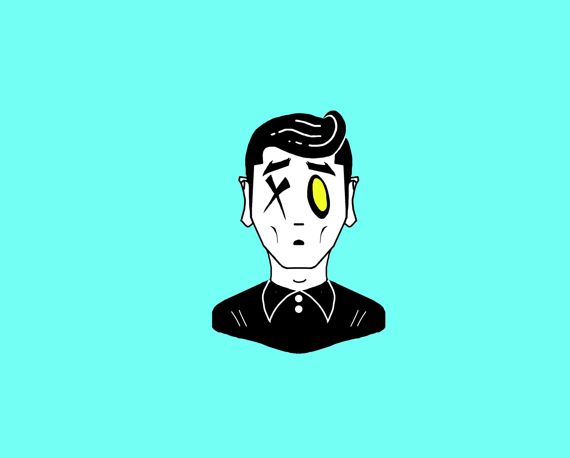
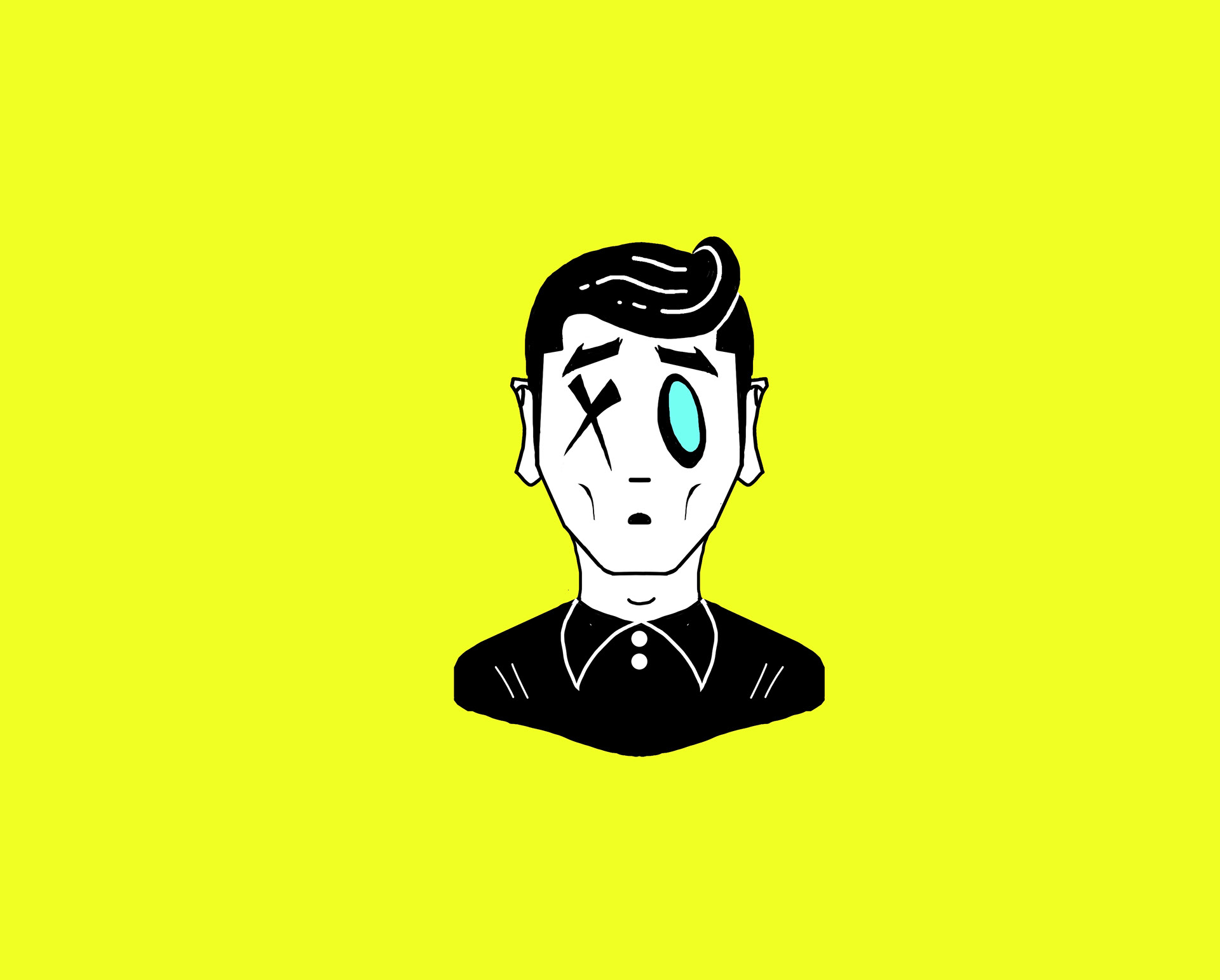
Jsemp_Art is my social media influencing platform for art. Once my instagram account surpassed 100k followers, I realized that it was becoming more than just an account and it was turning into a brand. So naturally, branding was in order. I created this icon as a caracature of me in a uniquely artistic way. I believed it to be a tactical move to make the icon a caracature for potential future merchandise such as clothing or art supplies products.
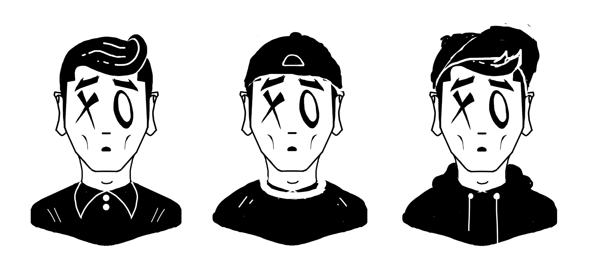
These were the three different designs that I created as potential options and ended up gravitating towards the first one (which is why the other two are not cleaned up and vectorized). I designed the second and the third with hats because I often wear hats in my tutorial videos, however I though that the option without the hat would avert the risk of making the hat more skewed towards a male audience.
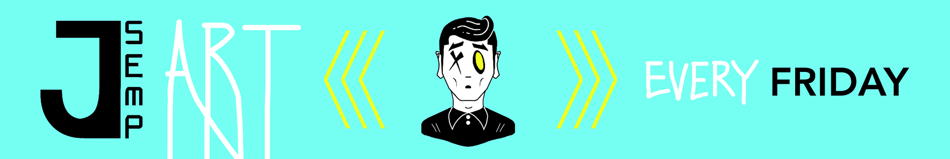
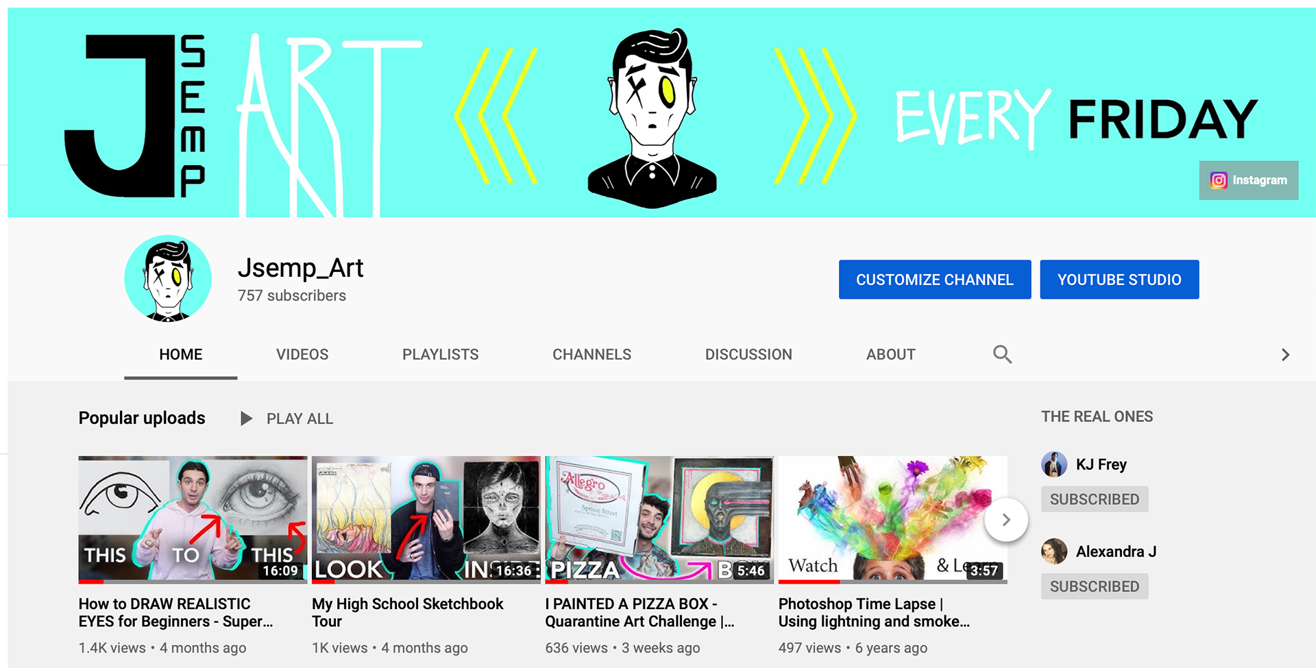
This is the banner that I designed for my YouTube channel that maintains the identity color palette.

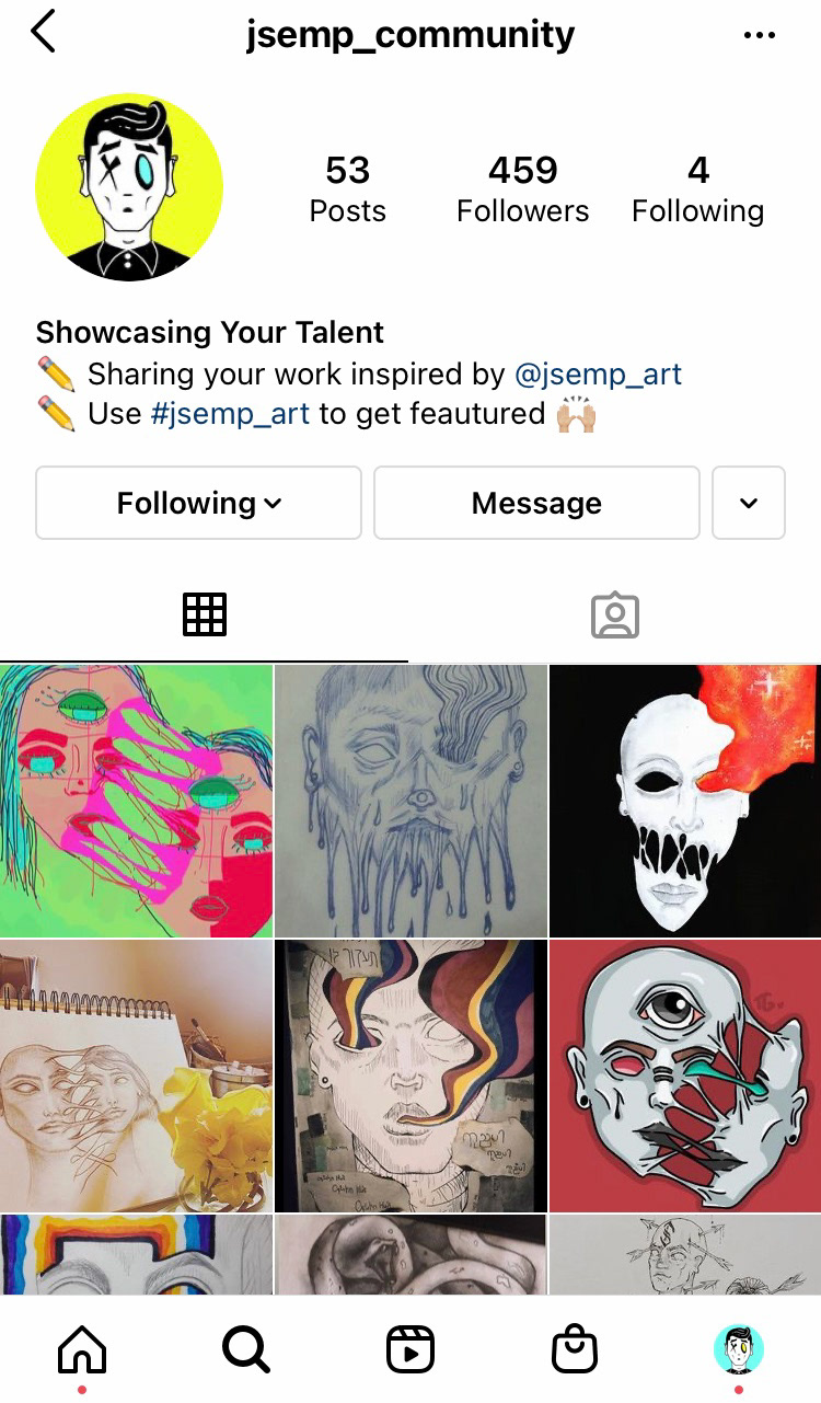
These screenshots allow you to see how well the designs integrate into the UI of the different social media platforms. For my main instagram I utilized the turquoise background with yellow eye icon and for the my community page (a page where I post art done by my followers thats inspired by my work) I utilized the inverse design with the yellow background and turquoise eye.
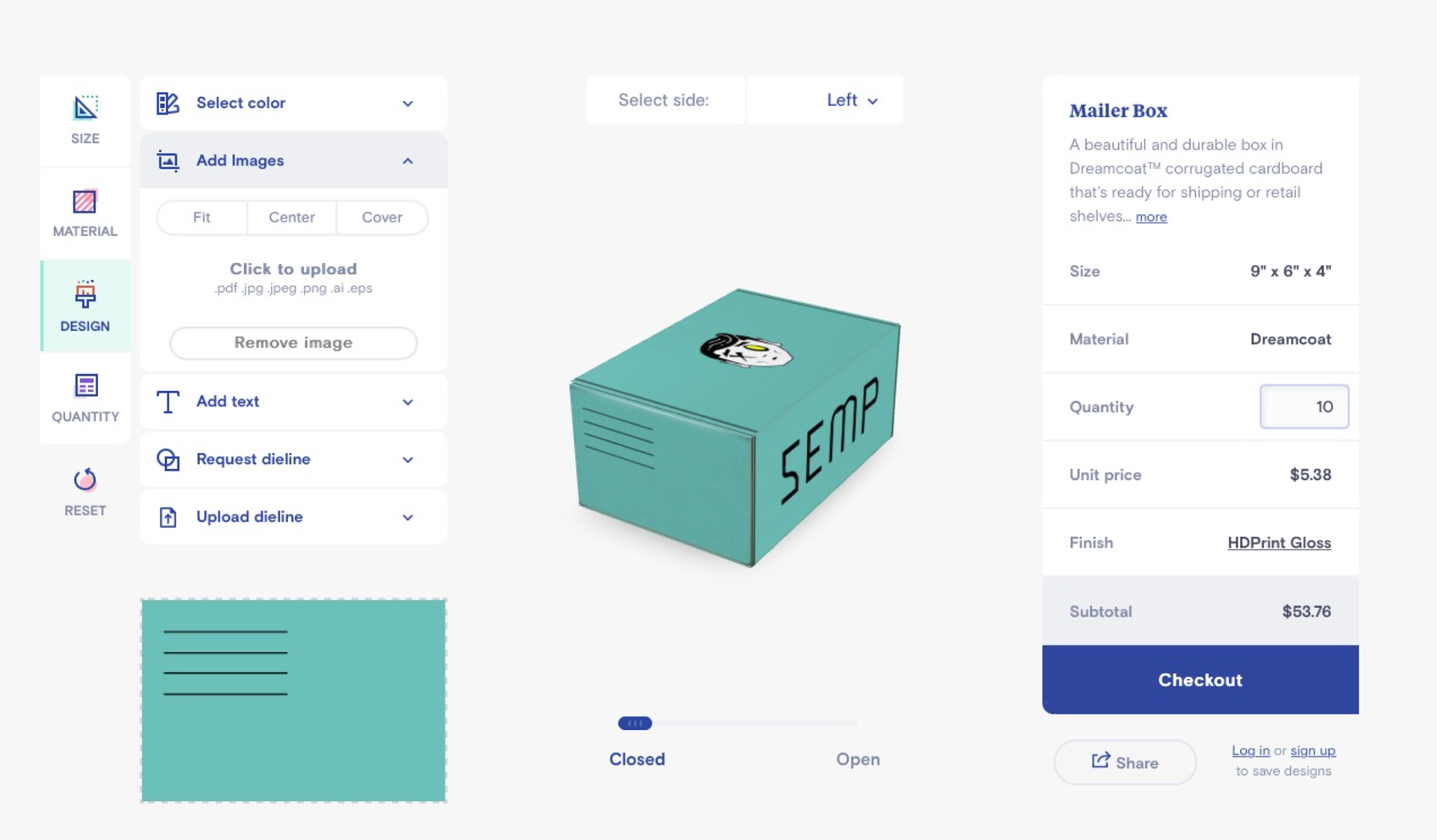
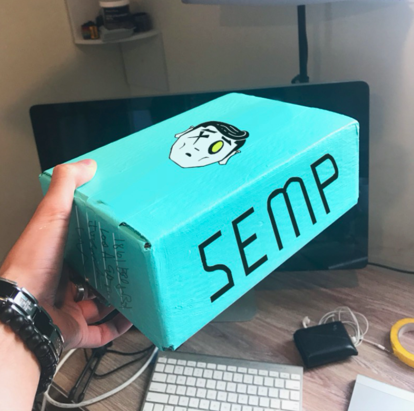
This is the box design for an "Art Box" that I created to sell to my followers. An art box is an assortment of different art supplies sourced from different brands put into a single box for a great price. I am creating this box so my followers can get all of the supplies that I find the most helpful in my art and create amazing things for themselves.

This is an affiliated brand that I created for a fashion line that still maintains the Jsemp_art brand. I didn't want to name it Jsemp because its not merchandised apparel that just has the art I post on it. The brands blueprint will will be that of a clean graphic design style that is in line with my icon but will also incorporate original drawings of mine. I wanted to create an authentic brand that also had the ability to leverage the thousands of followers that I already have. The logo represents an "S" in the shape of a drip. The S stands for Semp while the drip is a reference to the term "drip" which is slang for fashionable clothing. Additionally in the fully custom typography, I made the "S" in the shape of an hourglass to convey the idea that this brand will be timeless.
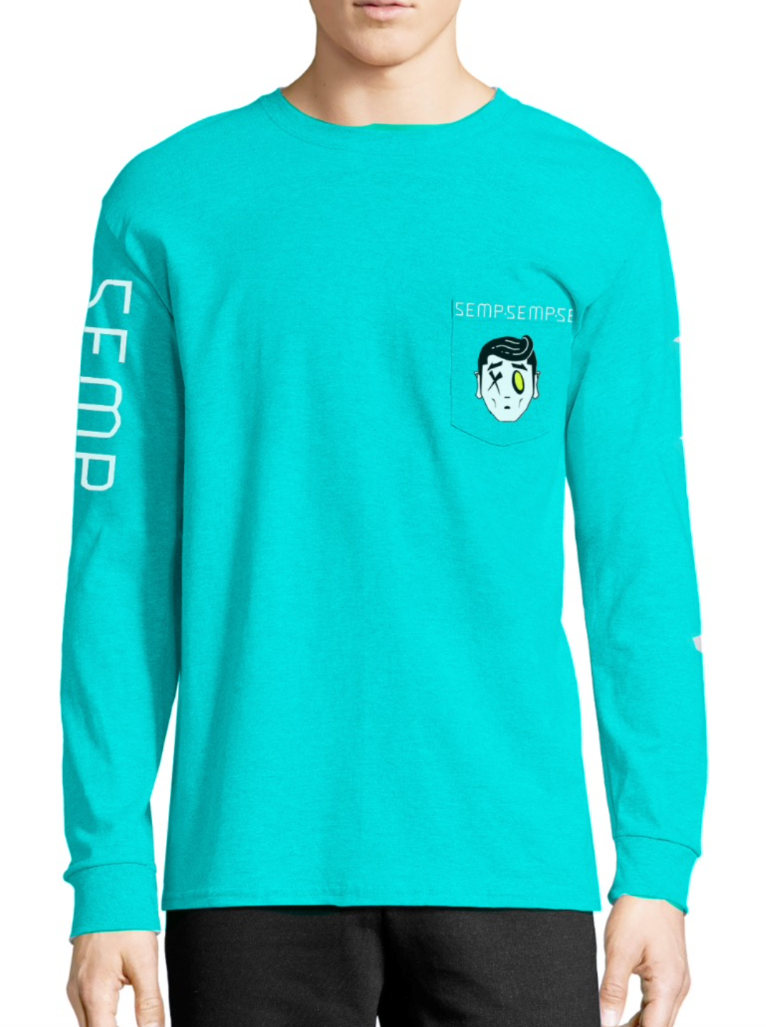


These are some potential designsI have mocked up in Photoshop. This brand is still in its early stages but its growth has a lot of potential to market my social media accounts and vice versa.