I had the opportunity to work with both of these companies through working as a freelancer for Godling Studio, an ad agency based out of Los Angeles.
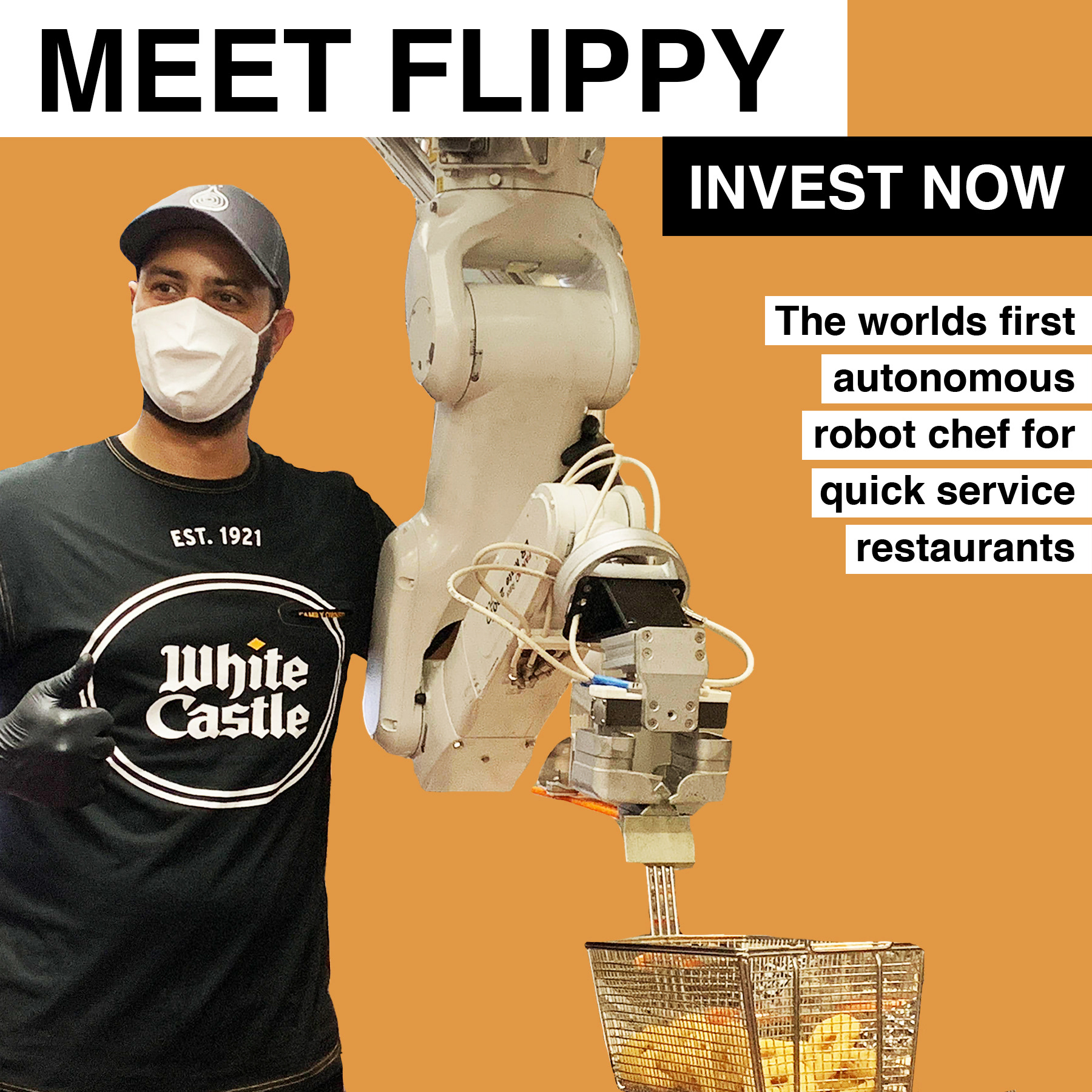
White Castle x Miso Robotics
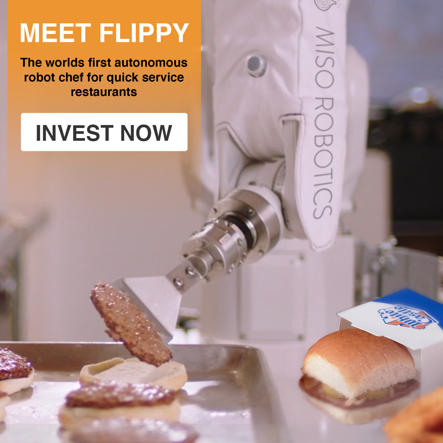

I was given a promotional video made by Miso Robotics and was tasked with creating graphics based on stills that I would have to capture from that video. These graphics would be used for pitch decks and social media campaigns. I was given a font, specific copy, and the blue and orange color pallet of White Castle to be incorporated into each design.
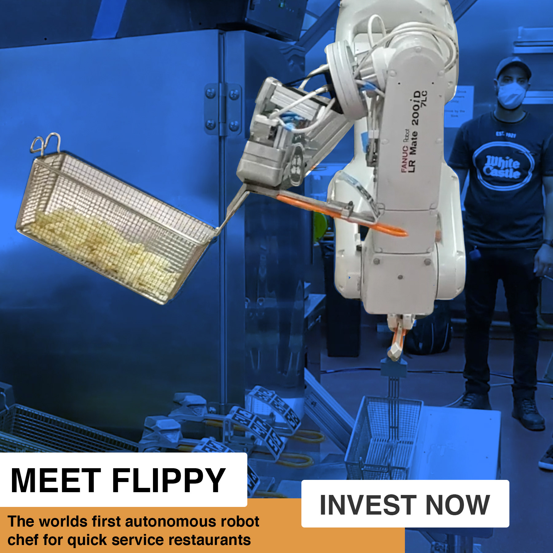
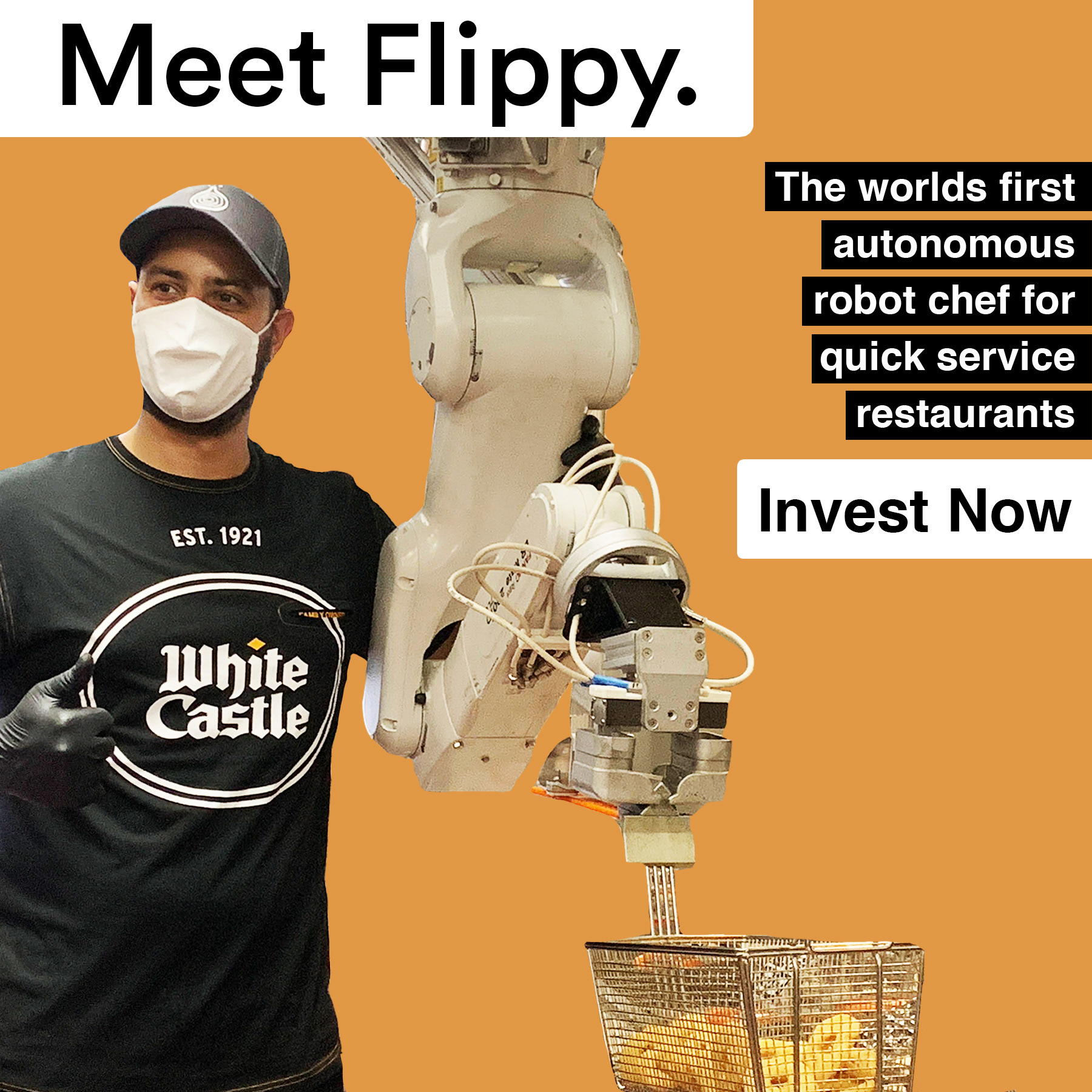
These are additional iterations of the previous designs. I utilized this blocky, straight forward style in order to match the other work that was being done from other designers working for Godling.
NANA
NANA is a transformative medicine company that offers a new kind of solution centered on psychoactives. Their focus is on a therapy solution for mental health.
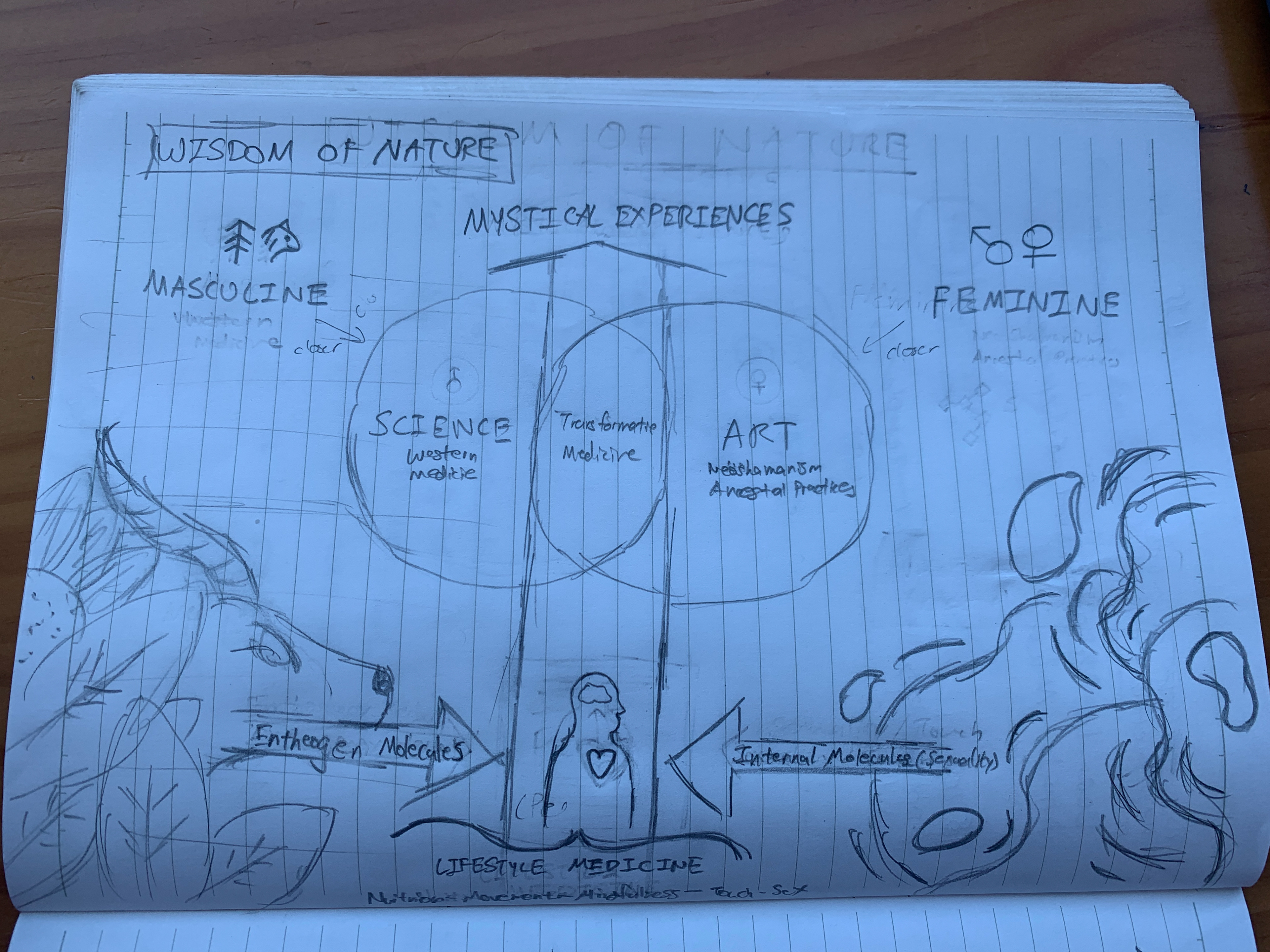
I was given this sketch from the company to create a graphic that would be used in marketing assets and their website. To give me an understanding of their visual identity, they also gave me one of their pitch decks (which unfortunately I am unable to share due to requested discretion). The guidelines were that there had to be actual photography incorporated in order to align with the rest of their identity and it needed to have a 16:9 aspect ratio.
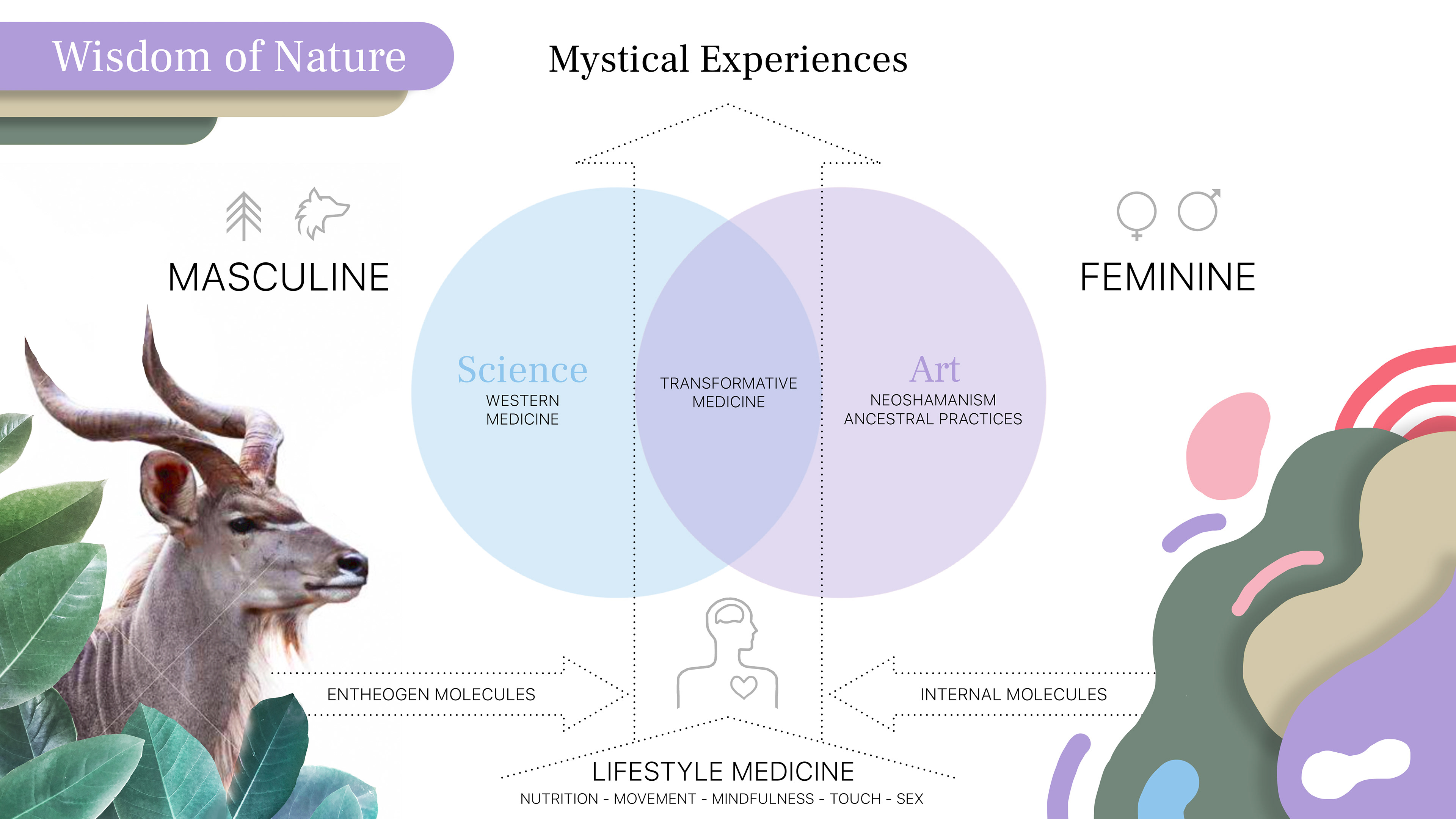
My first iteration of the design was a direct take on the sketch, trying to create a creative balance while incorporating everything they wanted.
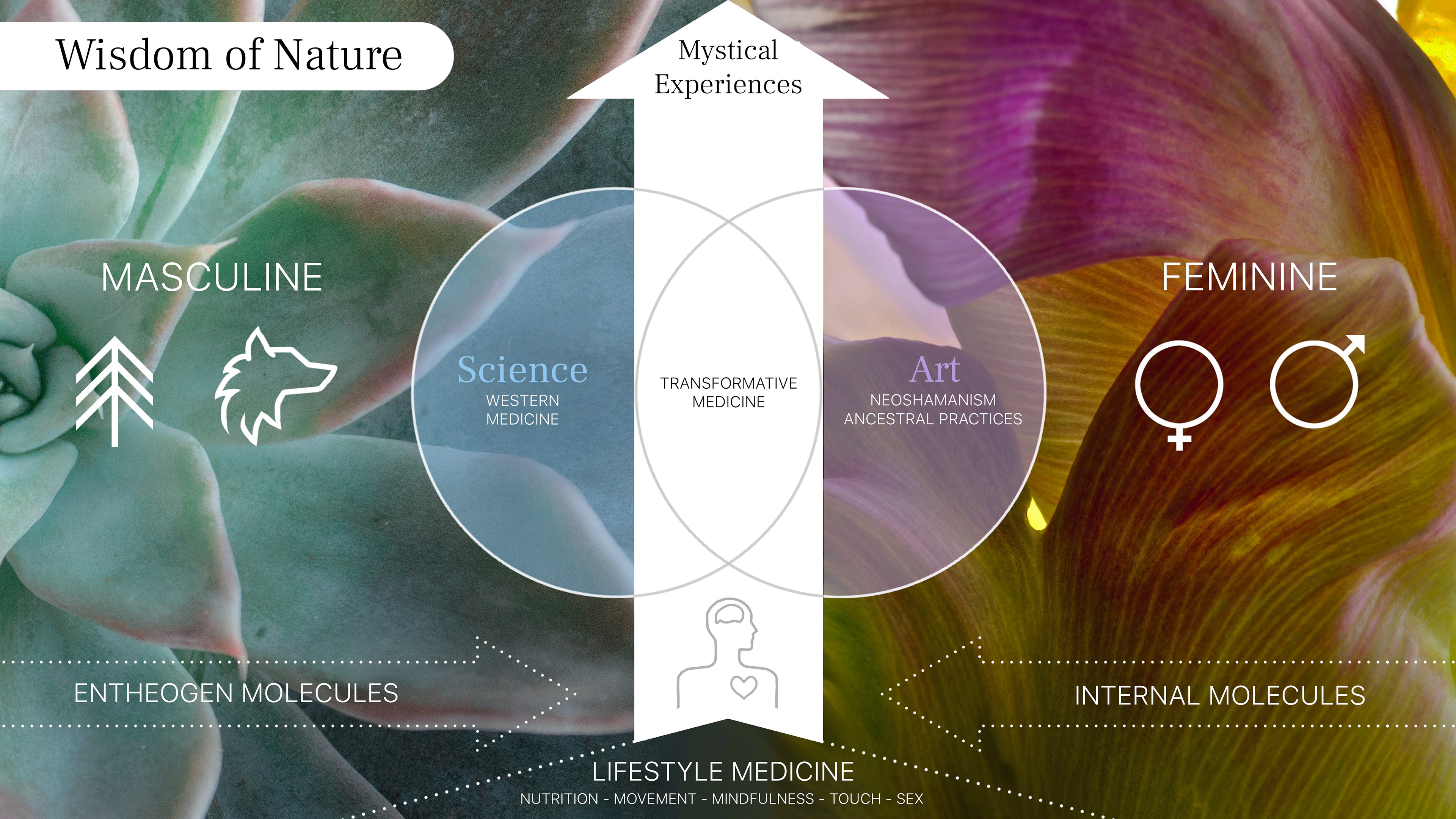
I also wanted to create an iteration that was more aligned with their visual identity but still maintained the integrity of the original sketch.

This is the icon sheet I made that included all of the vectorized icons for company use in future design work.